Rates vs Stocks: What Happens Next?

Video Recorded: November 12th, 2024

Dear Friends,

We are including in this writeup the visuals we discussed in this episode of Random Gleanings – you can find our video updates at www.youtube.com/@proplanwealth any time you’d like.

The charts we share come from economic and market topics that we think are interesting and are part of the story as it relates to investment portfolios. We don’t intend them to be “The Gospel”, but rather simply part of the story and things that may be worth keeping an eye on.

With that, here are this week’s charts! You can watch this week’s Random Gleanings for more content on each chart.

A new year in the markets gives rise to many prognostications being made for 12 months out.  In this first Random Gleanings of 2025, rather than offering conclusions on what stocks will do in the year ahead Jesse and Chris offer up data on what the market is doing, and what that might mean looking ahead.  

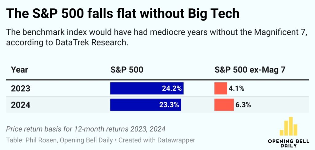
The guys start with a pretty stunning chart showing how the last two years would have looked vastly different if not for the contribution of the Magnificent Seven (ie. Megacap Tech stocks – Apple, Nvidia, Microsoft, Meta (Facebook), Amazon, Google & Tesla).  These seven (7!!!) companies have been responsible for 80% of the return of the S&P500 Index return over the last two years.  Said differently, 493 companies have only contributed 20% of the growth of the S&P500 over the last two years.  Nothing says this concentration trend has to end, but it has been quite unusual… and rather frustrating to those who seek some risk managed returns by way of broader diversification. 

1 SPY Ex Mag 7
2B Last 10 Years

Depending on your starting point for historical reference, markets have had an average annual return of somewhere between ~8.5% (1928-now) or ~11.2% (1980s-now).  The chart above shows the Compound Average Growth Rate (CAGR) of the last 10 years has been 13.48%.  Pointing this information out is not to suggest that markets immediately turn negative to revert to the longer-term average return, but rather to help establish that forward returns may not be as strong as they have been more recently. 

Moving to an internal look at markets the chart above suggests that the breadth of GLOBAL Stocks are not particularly strong.  You can see how the trend of the 200-Day Average (orange line) tends to lead the market (All Caps World Index – ACWI, in this case) which is not a particularly encouraging sign for global stocks at the moment.

3 Global Breadth
4 Sector Strength

If the case you say, I’m a domestic investor, not a global investor… we hear you.  Of late, there’s not been much reason to invest outside the US.  Unfortunately, some internal data specific to the US has some less than encouraging news as well.  This bottom half of the chart is showing how many (of the 11) sectors are above their own 200-Day Average at any given time.  Currently, you see, seven of the 11 sectors are above their 200-Day Average.  This puts the researcher (Willie Delwiche, HiMount Research) on a more cautious footing, as S&P500 performance when just 2-8 of the 11 sectors are above their 200-Day Average is not very compelling… in fact it’s been negative since 1999.

What the chart is showing is that the average allocation (per the AAII Asset Allocation Survey) since 1988 has been roughly 62% Stock, 16% Bonds, and 22% Cash.  Right now allocation to stocks, per the survey, purports to be about 13% above the average.  Whether it is simply a buy & hold imbalance created by stock outperformance over bonds and cash of late or investor psychology being what it is suggesting that when stocks have performed well, more money flows to stocks – See 1999 – this allocation tends to revert to the long-term mean not is a smooth, but rather a swift manner.   

5 AAII Asset Allocation Survey
6 2 Year vs Fed Funds

Something that may prove to be a headwind in the advancement of stocks in 2025 is the recent anticipation that the Fed would be cutting their rate two times in 2025 (per the December release of their Summary of Economic Projections).  The yield on 2-year treasuries having risen to where the Fed Funds Rate (FFR) is currently suggests that no more cuts are necessary anytime soon.  Yields rising has been a reaction to a strong economic backdrop and some renewed concerns over inflation returning. 

In other yield developments, the yield curve has un-inverted and is steepening.  The un-inversion (returning to a normal curve where shorter maturing bonds are paying less than longer maturing bonds) is a necessary development for a healthy environment, however as Chris suggests in the video depending on how high yields go on the longer end is perhaps the big risk to watch out for in 2025 for stocks.  Given the role yields play in the valuation of stocks, this new higher yielding world may negatively impact stock valuations… which for some (those seven stocks we looked at in the beginning) happen to be quite high.

7 Yield Curve